Skip to content

A compass needle sits etched across my back: S at the top, N at the bottom, with the arms of a cross between them.
The interviewer noticed it first when my collar shifted mid-sentence. He was Christian himself, in a country where a cross on someone’s skin can often quietly decide who gets the job. He asked if that’s what it was. I said no. The question comes often, from the devout and the curious alike, both equally having forgotten the way the world used to face.
The tattoo is a relic of a louder, more rebellious period of my life in London – one where I was one of the few brown faces in rooms debating power, and being loud back felt like the only available answer. I drew the compass myself in blue ink on a napkin, south marked at the top, before handing the drawing to a friend to make it permanent in her kitchen. But the answer to his question predates my small act of defiance by several thousand years.
Everything we know about maps is not a neutral fact, least of all their orientation. For over two centuries, South-up cartography developed in the Islamic world through successive scholars, each adding a missing piece to the tapestry the last one left behind.
Abu Zayd al-Balkhi, a 9th-century Persian geographer and scholar, provides one of the earliest examples of South-up cartography inis foundational work, The Book of the Configurations of the Regions (Kitab Suwar al-Aqalim), a geographical text containing maps and descriptions of the Islamic world, composed around 920 CE. during the reign of the Abbasid caliph al-Muqtadir. He lived north of Mecca, and he oriented his maps South-up deliberately to ensure that a reader tracing the page moved upward towards Islam’s holiest city, Mecca, rather than down and away from it. Although his maps were spare schematics, the convention held and was picked up nearly a generation later by Abu Ishaq al-Istakhri, who expanded al-Balkhi’s sketches into fuller regional surveys of the Islamic provinces, still oriented South-up. Then came Abu al-Qasim Ibn Hawqal, a 10th-century Arab geographer and traveller, who spent over two decades conducting extensive fieldwork to correct and refine these charts against what he witnessed firsthand – collectively laying the empirical foundation on which the Balkhi school of cartography would stand for the next two hundred years.
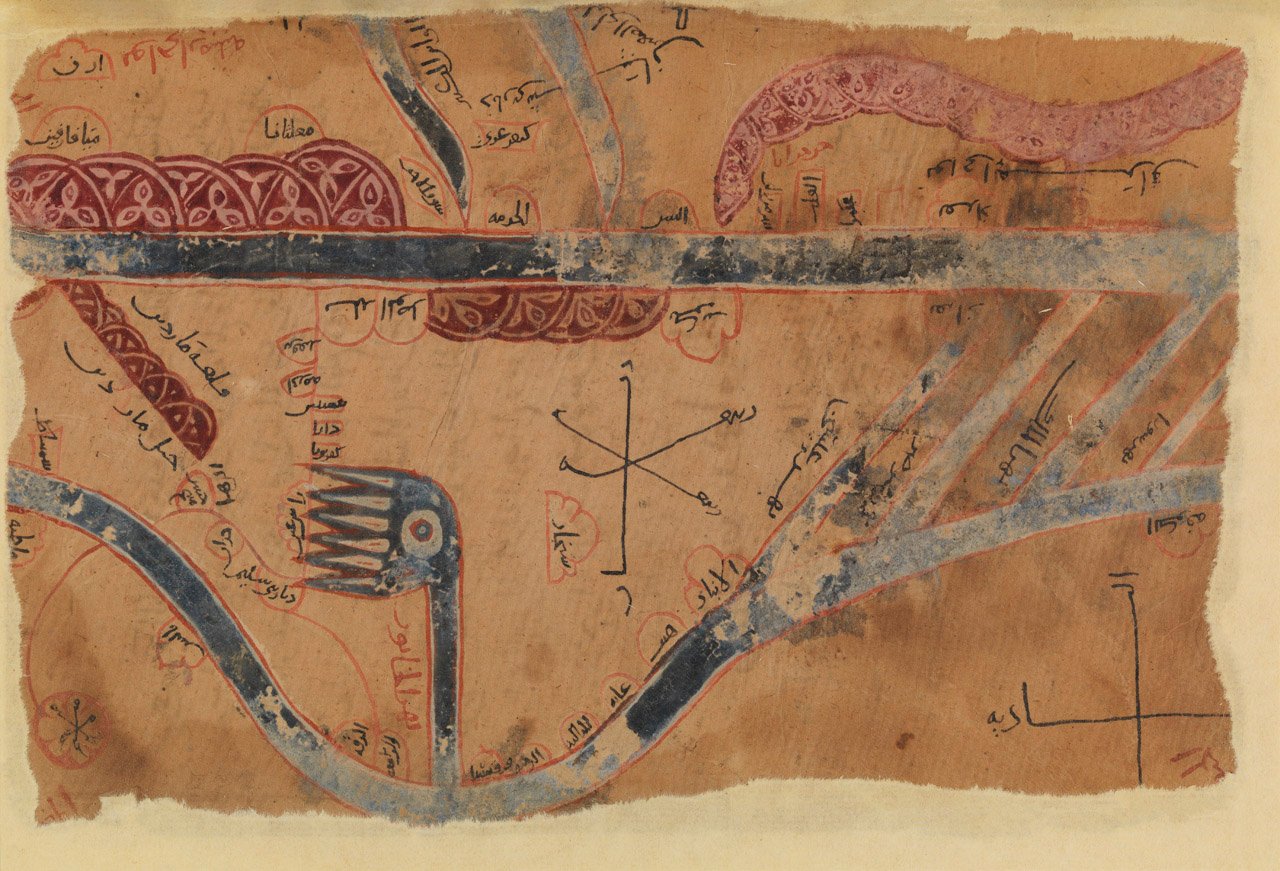
As the Abbasid Caliphate fragmented throughout the tenth century, Balkhi maps continued to depict the Islamic world as a single, undivided domain. Deliberately commissioned by rulers eager to project authority over lands slipping from their grasp. By the time Muhammad Al-Idrisi, a 12th-century Arab geographer and cartographer who worked at the Norman court in Sicily, arrived in Palermo, he had inherited two centuries of Balkhi methodology built on al-Balkhi’s spatial framework, al-Istakhri’s expanded surveys, and Ibn Hawqal’s empirical field corrections. Though he was born in Ceuta in 1100 and educated in Cordoba, al-Idrisi’s move to Sicily was born of a historical paradox. King Roger II had spent decades completing the Norman conquest of Sicily, dismantling Muslim political rule across the island. In recruiting al-Idrisi from Andalusian Spain, Roger II offered the Arab scholar safe harbor and royal funding to harness Islamic geographical science for the Norman crown. In return, al-Idrisi found a patron with both the capital and the state imperative to demand granular intelligence—governing a kingdom hastily patched together from Byzantine, Arab, and Norman territories at the precise crossroads of Mediterranean commerce.
For fifteen years, al-Idrisi systematically cross-examined merchants and sailors arriving in Palermo, vetting their firsthand reports against customs ledgers and earlier Balkhi surveys, ruthlessly documenting the realities of active trade routes. The resulting Nuzhat al-Mushtaq (commonly known as the Tabula Rogeriana) was completed in 1154.
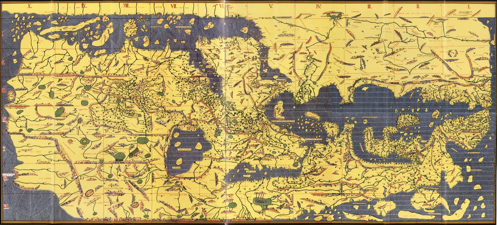
It encompassed a working atlas of seventy sectional maps alongside a composite world map engraved onto a 300-pound silver planisphere. It was an ambitious articulation of state infrastructure, built in precious metal to allow for visual representation and management of economic reach. South sat at the top of his map for the same pragmatic reason it always had in the Balkhi tradition: this is where the density of trade, tribute, and imperial reach was highest when the map was drawn.
By the sixteenth century, the material center of gravity moved. The Mediterranean was displaced by the violent expansion of Atlantic trade routes toward the Americas, West Africa, and beyond the Indian Ocean. As Europeans set out to organize an oceanic economy, Idrisi’s regional ledger would undergo a fundamental recalibration. In 1569, the Flemish cartographer Gerardus Mercator supplied a world map designed to solve the logistical challenges of navigating the vast open ocean, essential for the expansion of oceanic trade. By projecting a spherical Earth onto a flat grid where lines of constant compass bearing remained straight, Mercator created a central navigational tool that allowed transatlantic fleets to plot long-distance courses without constantly recalculating compass headings.

Designed with maritime navigation in mind, Mercator’s world map introduced a projection that represented lines of constant compass bearing as straight lines, helping navigators plot courses across the open ocean.
Yet this “technical” solution required a mathematical distortion with immense material consequence. In flattening the globe, Mercator chose to preserve angles at the expense of land area. The resulting image shrinks the equatorial band – Africa, South America, South Asia – precisely where resource extraction, climate damage, and unequal exchange have landed the hardest, while enlarging the powers that profited from all three. What began as a mathematical convenience for ship captains quickly hardened into a universal visual hierarchy, with the North permanently locked at the top of the world, sailing to the tune of European maritime power.
Marxist geographer David Harvey argued that capital solves its internal crises through “spatial fixes” by expanding outward, reorganizing global space to make extraction and accumulation efficient and predictable. Mercator’s projection provided the cartographic blueprint for colonial extraction. It commodified global space, turning oceans and continents into balance sheets. South fell to the bottom of the map for the same material reason it had once ruled the top.
Not because of an inherent spatial truth, but because power, trade, and capital accumulation had moved. But the ultimate success of a spatial fix occurs when the infrastructure of power stops looking like a choice. Therein lies the true triumph of Mercator’s projection: it convinced the world its orientation was a law of physics. Today, encoded into the satellite grids of GPS and the smartphone maps in our pockets, North-up cartography operates as an unquestioned, hegemonic norm.
The erasure is so complete that it has swallowed even the memory of its alternatives. When people look at the compass on my back, no one recognizes it as a map. Even in the Middle East, where scholars spent centuries refining the South-up tradition, this foundational historical norm now looks like an error, or a Christian cross at best.
This September, the fight over projections reached the UN General Assembly when a resolution by Togo passed 164 to 1 to “gradually adopt” the Equal Earth projection. If Mercator was the spatial fix for the sixteenth century, keeping it as the default map has been the spatial fix for every extraction since. But we won’t win that fight on an international floor while ignoring the spatial fixes operating within our borders.
In Cairo, spatial management is entrenched through matrixes of power and control that shape daily survival. You see it in the rising hostility toward the darker faces of Africa arriving in the city, refugees fleeing war only to be scapegoated for soaring rent prices and rising gang violence. The “bottom” in Cairo’s map is not a single unified class, it is fragmented and fractured along race, gender, and religious lines. Indeed, you feel the aggressive hand of capital whenever you soar on elevated flyovers built over dense, working-class neighborhoods to connect gated developments on the desert periphery. Cairo manages its own internal North and South in concrete and asphalt, reorganizing its land at the expense of those least equipped to resist.
I was once told not to tattoo something on my body unless the idea had stayed with me for a long time. I can’t say I’ve always known which way the world used to face, but I have always wondered who gets to orient it, who gets to draw its borders, and who is made to disappear beneath them. From the maps that once turned the world upside down to the flyovers that now cut through Cairo, the question remains the same: whose world are we building, and whose lives are we willing to leave behind?